Categories
Data Visualizations

Clinical Trials: Before, During, and After the Pandemic

Research Question

How did the COVID-19 pandemic reshape the likelihood that an interventional clinical trial registered on ClinicalTrials.gov would both begin and reach completion?

More precisely, I track how yearly attempts (new trial registrations), successes (completed trials with posted results), and failures (terminated or withdrawn trials) shifted across three windows: pre-pandemic (2015-2019), pandemic onset (2020-2021), and early-recovery (2022-2025). I layered in sponsor type, participant age, and other study-design details, and I aim to reveal which corners of the research pipeline proved resilient and which still show scarring.

Data & Key Variables

The analysis draws on the Aggregate Analysis of ClinicalTrials.gov (AACT) relational database, a public mirror of every record on ClinicalTrials.gov maintained by the Clinical Trials Transformation Initiative and refreshed daily. I worked with the static snapshot dated 1 April 2025 from the same date in 2015.

Core tables and fields include:

Table → FieldWhat it representsHow I use it
studies.first_posted_dateDate the trial was first registeredCounts attempts per year
studies.overall_statusCurrent status (Completed, Terminated, Withdrawn, etc.)Flags success vs. failure
studies.results_first_posted_dateDate results were postedVerifies that a “Completed” study reported outcomes
sponsors.nameLead sponsor (industry, academic, hospital, etc.)Breaks out trends by top sponsors
eligibilities.minimum_age / maximum_ageAge range of eligible participantsGroups trials into Child (<18) and Older Adult (≥65) cohorts
designs.maskingLevel of subject masking (Open-label, Double-blind, etc.)Explored as an additional pandemic-sensitive factor

Limitations & biases

Several limitations affect this analysis. Trials activated late in 2024 and 2025 are too recent to have reached completion, causing recent success rates to appear artificially low. Also, the registry does not always reflect reality because study teams may delay updating their trial statuses. Using a simple success-or-failure categorization also obscures important nuances, since intermediate statuses such as “Active, not recruiting” or “Suspended” are combined into these two categories. We must also consider that health-system disruptions varied significantly from country to country, yet each trial is treated equally, which masks important regional differences.

Interpreting the Numbers for a Non-Data Audience

Think of the global clinical-trial ecosystem as a production line. Attempts are raw materials entering the line, successes are finished products, and failures are discarded parts.

During 2020-21, the factory floor stayed open; raw material kept arriving. But staffing shortages, lockdowns, and hospital surges jammed the conveyor belts, so fewer products rolled off the line and more were scrapped.

The age-group view reveals where the choke points were sharpest. Pediatric studies rely on school clinics, parental consent, and specialized monitoring—each tougher to arrange mid-pandemic. Conversely, geriatric trials—especially in infectious-disease therapeutics—received emergency funding and regulatory fast-tracks.

Sponsor analysis underscores capacity disparities. Industry giants such as Pfizer pared back non-COVID pipelines to prioritize vaccine R&D, while universities in lower-income regions pressed ahead with ongoing studies—sometimes because there was simply no alternative funding source to pivot toward.

Finally, masking practices remind us that methodology bends to crisis pressures. Double-blind designs—which are gold-standard but resource-heavy—gave way to pragmatic open-label approaches when courier networks, investigational pharmacies, and on-site monitoring collapsed.

Visualizations of the Data

  1. Clinical Trial Treemap of Attempts, Successes, and Failures

The treemap categorizes all studies from the AACT database into three outcomes—attempted, succeeded, and failed—and allows users to switch between three different time periods. In the baseline from 2015 to 2019, the “Attempts per Year” category clearly dominated, showing that 106,954 new interventional trials were registered. Within this large group, “Successes per Year” represented a significant share: 66,214 studies, or about 62%, were completed successfully. The “Failures per Year” category was much smaller, with only 8,192 trials, representing less than 8% of all trials. About 30% remained unfinished at the time of the 2025 snapshot.

Moving the filter to the pandemic period of 2020–2021 shrinks the total number of trials significantly. Attempts dropped by 52% to 51,255, visibly cutting the treemap nearly in half. The decline in successful completions was even greater, falling by 64% to just 24,140 trials. Although failures also decreased to 2,926, this change was less noticeable because total attempts fell so sharply. The increased empty space represents trials that did not complete or fail but were delayed significantly.

Switching to the recovery period from 2022–2025 shows a partial rebound. Total attempts rose again to 83,806, about 80% of their original level, showing renewed interest in starting new trials. However, successful completions did not recover as strongly, reaching only 21,616, about one-third of their pre-pandemic level. The small number of failures—just 1,520, or about 2%—highlights that most newer trials have not yet reached completion, leaving even more unfinished studies.

As we step back and look at these shifts, they reveal a clear story: COVID-19 significantly disrupted the start and completion of clinical trials. Although new registrations have returned close to normal, a substantial backlog of incomplete trials remains. This backlog suggests ongoing delays in evidence generation, unless regulatory agencies and funders can help speed up late-stage trial activities.

2. Clinical Trial Line Graph of Age Groups

The line graph shows how often clinical trials specifically included children under eighteen and adults aged sixty-five and older. Between 2015 and 2019, around 16.7% of registered trials included children, while about 73.8% allowed older adults to participate. When the pandemic started, the percentage of trials including children dropped to 15.4%. Though this decrease might seem small, it represents a significant reduction across thousands of studies. This happened because schools closed, parents became reluctant to visit hospitals, and pediatric units redirected resources to COVID-19 care.

During the same period, trials welcoming older adults rose to 75.7%. This increase largely came from new vaccine, antiviral, and therapeutic studies aimed at seniors, the group most vulnerable to severe COVID-19 illness. Regulatory guidelines from 2020 and 2021 also encouraged researchers to include seniors, leading ethics committees to quickly approve broader age ranges.

In the recovery period from 2022 to 2025, the patterns shifted slightly back toward pre-pandemic levels, but not entirely. Pediatric inclusion rose again to 16.1%, nearly returning to its earlier level as pediatric research groups resumed work and remote consent methods improved. However, senior inclusion dropped slightly to 72.9%. Once the urgent need for COVID-specific trials decreased, researchers again narrowed eligibility criteria to reduce risks and simplify monitoring.

Together, these trends highlight how quickly demographic priorities in clinical research can change during a crisis. They also show that such changes can have lasting effects. Pediatric trials are still below their pre-pandemic participation rate, meaning fewer studies and less evidence for children’s health. Unless research funders and ethics boards actively support balanced inclusion, this gap might continue even after the pandemic ends.


3. Clinical Trial Top 20 Sponsors

The bar chart ranks the twenty most active trial sponsors and lets users switch between three different periods defined by the pandemic. This helps show how the types of institutions involved changed over time. Between 2015 and 2019, academic medical centers led the way. Cairo University alone represented about 1.25% of all trial registrations worldwide, far ahead of industry leaders like AstraZeneca. Most of the other top spots were also held by universities and national hospitals, including Johns Hopkins, M. D. Anderson, and Fudan, highlighting that investigator-led research was the main driver of trial activity before COVID-19.

Switching the filter to 2020-2021 changes the picture in two noticeable ways. First, Cairo University’s share increased, likely because it continued smaller, single-site studies while wealthier institutions paused their non-essential research. Second, Pfizer’s ranking rose sharply due to its rapid launch of multiple vaccine, booster, and antiviral trials. Even though Pfizer’s total number of trials was relatively small, each trial counted separately, greatly increasing its presence. Other big companies like AstraZeneca and Novartis also saw modest increases, but none matched Pfizer’s rapid rise.

Moving the filter to 2022-2025 shows another shift. Cairo University remains the top contributor, while Pfizer settles firmly into second place, accounting for just over 1% of all registrations. Several U.S. academic institutions slightly fall in rank, not due to fewer studies, but because universities in China and the Middle East—like Jiangsu Hengrui, the Second Affiliated Hospital of Zhejiang, and Ain Shams—continue rapidly expanding their trials in oncology and metabolic diseases, outpacing growth in the West. Companies like Eli Lilly, GSK, and AstraZeneca return closer to their pre-pandemic levels, reflecting their shift back to focused, priority-based trial strategies once the vaccine rush ended.

Overall, these changes illustrate decentralized resilience. During COVID-19, global clinical research did not rely solely on a few large pharmaceutical companies; instead, thousands of smaller, low- and middle-income academic institutions like Cairo University kept the process moving. While pharmaceutical companies made targeted, significant contributions—especially Pfizer—the recovery in trial numbers since 2021 has been driven mostly by universities, particularly from Asia and the Middle East. Policymakers should recognize that supporting public research institutions may offer more consistent stability than depending solely on commercial sponsors whose involvement varies greatly with changing priorities.


Conclusions and Future Research

The pandemic exposed several weaknesses in the clinical-research system, yet it also highlighted the community’s ability to adapt quickly under pressure. Different sectors showed varying levels of resilience. Academic medical centers and smaller sponsors mostly kept their research moving forward, while the heavily regulated pharmaceutical industry paused, adjusted, and eventually restarted with fewer, high-priority projects.

One clear consequence of this disruption was the neglect of pediatric trials. Children’s clinical research relies heavily on school-based recruitment, parental consent, and specialized hospital resources—all severely impacted during lockdowns and resource shortages. Protecting pediatric trials should become a primary focus for ethics committees and funding organizations in future emergency planning.

The pandemic showed the importance of flexible methods in research. When in-person visits became impossible and placebo supplies faced disruptions, researchers switched to open-label or single-blind methods. Regulatory agencies can maintain the quality of research during future crises if they approve backup plans in advance. This will allow trials to adapt quickly without losing important data or accuracy.

Several important areas need further study. Researchers should examine geographic differences closely to see if stricter lockdown measures caused more delays or dropouts in clinical trials. Analytical methods that measure completion time, instead of just success or failure, would provide a clearer picture of the pandemic’s impact. I also think that looking at this data by month will show us more of an immediate view of the impact the shutdown and the pandemic starting in February and March of 2020. There also needs to be a way to make a visualization of this data by looking at the Phases of each trial that was attempted, either successfully or not.

Identifying exactly where the clinical research system broke down will allow stakeholders to strengthen these weak points. Making these improvements now ensures that essential medical research can continue smoothly during future global disruptions, keeping the process moving forward to save lives.
Categories
Uncategorized

Keeping my Cool: A Month‑long View of My Air‑Conditioner Habits

  • I began this project with a deceptively simple question: how often do I press the power button on my window air‑conditioner and what specific yet subjective personal or environmental cues persuade me to do so? Almost thirty spring days of meticulous logging every interaction between myself and my A/C between 28 March and 22 April 2025 provided the raw material for me to explore just how complex this simple question was by making three visualizations.

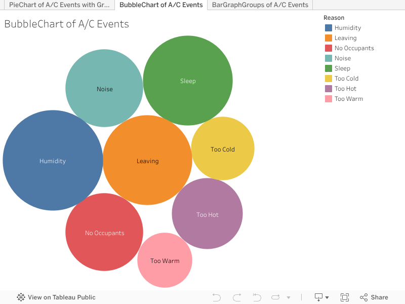
    Before interpreting the three following visualizations, readers need to understand the method of collection. I collected the data manually over seven consecutive days (28 March to 3 April 2025). Every single press of the ON/OFF button became a row in a Google Sheet, where I captured the exact date and time, whether the action turned the unit on or off, the fan speed or cooling mode chosen when the unit was activated, the indoor temperature read from a living‑room thermometer, the outdoor temperature taken from a local neighborhood weather app online, and the subjective reason I chose was from an eight‑item list that ranged from “Humidity” to “Too Cold.” I also grouped the timestamps into morning, afternoon, and evening blocks so that patterns by time of day would be simple to spot.

    var divElement = document.getElementById(‘viz1745380683996’); var vizElement = divElement.getElementsByTagName(‘object’)[0]; vizElement.style.width=’100%’;vizElement.style.height=(divElement.offsetWidth*0.75)+’px’; var scriptElement = document.createElement(‘script’); scriptElement.src = ‘https://public.tableau.com/javascripts/api/viz_v1.js’; vizElement.parentNode.insertBefore(scriptElement, vizElement);

    This bubble chart is the easiest way to introduce the data while also illustrating how vast the dataset is without overwhelming the reader with too many variables, although they are lurking beneath the visualization.

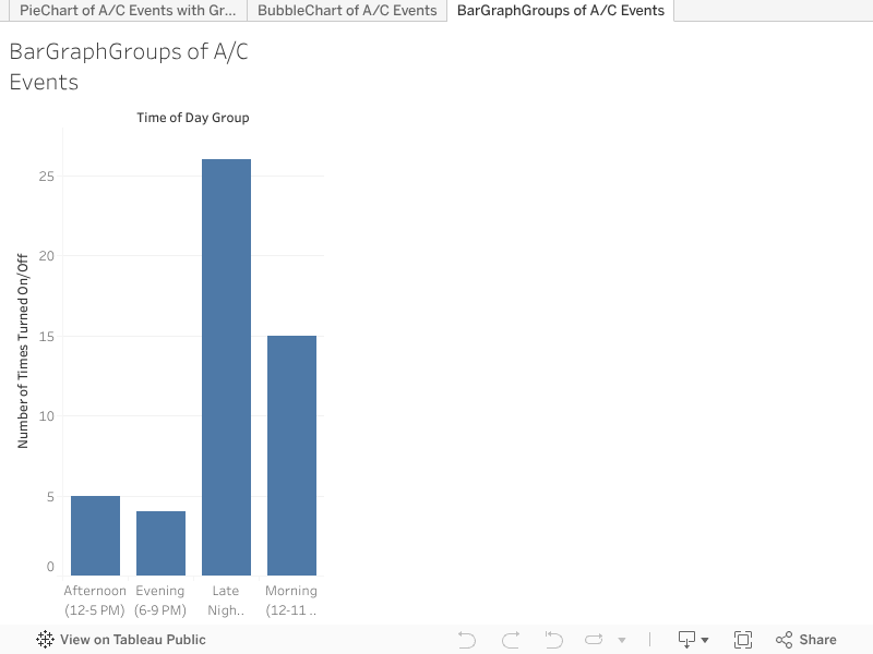
    The next visualization is the pie chart, which really flexes how much data we have here – this pie chart is actually animated and has four groupings for users to start to digest – this is the main part of the dataset that we “created” in a sense, the groups were decided and you could always say that it was arbitrarily done. But, “Afternoon” as 12-5pm, “Evening” as 6-9pm, “Late Night” as 10-11pm, and “Morning” as 12am-11pm makes sense because I am usually asleep during most of the “Morning.” I also think we are basically testing bubbles against pie charts here, but I also wanted to add the wrinkle of having four pie charts essentially through the animation.

    var divElement = document.getElementById(‘viz1745380437845’); var vizElement = divElement.getElementsByTagName(‘object’)[0]; vizElement.style.width=’100%’;vizElement.style.height=(divElement.offsetWidth*0.75)+’px’; var scriptElement = document.createElement(‘script’); scriptElement.src = ‘https://public.tableau.com/javascripts/api/viz_v1.js’; vizElement.parentNode.insertBefore(scriptElement, vizElement);

    The pie chart also shows you the human element to all of this in a colorful way, which is that the “Sleep” reason goes up during the Late Night grouping, which also tells you what time I go to sleep. The fact that I do not always or even a majority of the time use the sleep reason to turn off the A/C at night shows you that I do in fact sleep with it on, which is not recommended.

    var divElement = document.getElementById(‘viz1745380450314’); var vizElement = divElement.getElementsByTagName(‘object’)[0]; vizElement.style.width=’100%’;vizElement.style.height=(divElement.offsetWidth*0.75)+’px’; var scriptElement = document.createElement(‘script’); scriptElement.src = ‘https://public.tableau.com/javascripts/api/viz_v1.js’; vizElement.parentNode.insertBefore(scriptElement, vizElement);

    The bar chart towers at 26 toggles between 10 p.m. and 5 a.m., nearly half of the week’s total. I’m a light sleeper, and even a slight temperature drift or street noise makes me reach for the switch almost as a reflex. I also like the bar chart as the summary here because again, just seeing the grouping as separate pie charts does not allow you to compare the groupings, but then when we have the bar charts, that is the immediate clearest thing. We also did not show this in the bubble chart in the beginning so the user can decide which simple visualization impacted them more, the animated ones, or the simple ones.

    Even so, for the reader and myself, the exercise has practical value. I now know that a quieter fan mode might curb my noise‑inspired toggling, a small dehumidifier run overnight could reduce how many times I press it in the morning, and a smart plug could be used to automatically shut power between noon and five o’clock, which would eliminate wasted electricity. If I extend the study, I will automate data collection with a connected switch, pair it with continuous temperature and humidity sensors, and look at hourly electricity rates to see what the economics are behind these on/off decisions, since my background is in economics. Other researchers could expand the scope to multiple apartments or seasons, but for me, I think the overall message is pretty simple, which is that by paying attention to the tiny habitual decisions I make each day, I have uncovered real ways to save energy and improve everyday comfort and the evidence is sprinkled throughout this post in the three visualizations.

Categories
Data Visualizations

Data Visualization Project 1 by Rohan Ramnarain

Mapping New York’s Barks: Tracking NYC Dog-Barking Complaints (2010–2025)

Here is our research question for this project and visualization: How did dog-barking noise complaints filed with NYC’s 311 service (specifically those labeled “Noise, Barking Dog (NR5)”) evolve between 2010 and 2025 in the five boroughs and were there noticeable shifts before, during, and after the height of the COVID-19 pandemic?

The data originate from the NYC 311 Service Requests dataset, encompassing 2010 to 2025. I filtered specifically for complaints whose Descriptor field is “Noise, Barking Dog (NR5),” ensuring only barking‐dog incidents are included. Key variables include: the “Created Date”, which is the timestamp of each complaint (year, month, day, and time), the common “Descriptor (Noise, Barking Dog (NR5))” which is our only complaint being studied, and the “Borough”, “Latitude”, and “Longitude” for each of these complaints.

One limitation is that 311 data capture reported noise disturbances only and this of course masks the true incidence of barking, which might be higher, especially when you consider that against the backdrop of the COVID-19 pandemic, which could have added another layer of obfuscation and skewed the data in either direction, but most likely upwards – i.e, people spending more time at home may have noticed barking more often. But I digress… let’s take a look at these visualizations to get a feel for the data and the underlying trends that may help us answer our research question.

Graduated Symbol Map (2010–2025)

This map uses circles of varying size to represent the volume of barking-dog complaints within each area over the entire 2010–2025 span. Large circles indicate more complaints and the smaller circles indicate fewer complaints – but note that space and population density must be considered when looking at bubble sizes. The key thing that jumps out at you on first glance is how Brooklyn and Queens host numerous large circles, suggesting consistently high complaint volumes in certain neighborhoods. Manhattan shows many medium-sized circles in a smaller physical area, which shows how dense housing can amplify noise disturbances.

Choropleth Map

This choropleth map shades neighborhoods by the total count of “Noise, Barking Dog (NR5)” complaints from 2010–2025 with darker shades corresponding to higher complaint frequencies, and areas in deep blue or green shades being shown as hotspots for barking complaints. This helps pinpoint neighborhoods with persistent or widespread issues, potentially guiding targeted noise policy or outreach efforts. Everything is summed for that particular zipcode – that is how this map differs from the graduated symbol aside from aesthetics. This map is my ideal map for analyzing the dataset because I can spot my own zipcode and the zipcodes of my family members who may or may not own dogs and therefore may be the ideal audience for this particular visualization. The soft colors are also a plus in immediately identifying the areas of extreme complaint amounts.

Street Map with Colored Clusters

Here, each complaint is plotted as a distinct dot, color-coded by borough, which is a more granular visualization of exactly where—and how densely—barking complaints occur and density is the key to this visualization because the dense patches of orange in Brooklyn and teal in Queens reveal high concentrations of dog-barking complaints. Manhattan (red) is more compact but still dotted extensively, reflecting high population density and possibly greater sensitivity to noise as we saw in the first visualization. This has the added benefit of including commonly known and lived on streets, parks, and landmarks throughout the city. Out of all the visualizations, this one is perhaps the most inviting and the most interactive – I actually went and spotted the complaints right on the street outside my house, and the audience can do the same – this is also the most immediately related visualization.

Heat Map on Street Map

This final map applies a heat layer over the city, highlighting areas of the highest complaint density in darker or more intense “hot zones.”, a way to focus on the intense regions down to the local level in neighborhoods like Williamsburg, Greenpoint, and western Queens – these mirror the clusters we saw in previous maps. The heat map on the street level perhaps underscores how closely packed housing correlates with higher complaint density.

As we have seen, most of these “Noise, Barking Dog (NR5)” complaints are concentrated in Brooklyn and Queens, with certain Manhattan neighborhoods also showing high densities and the Bronx and Staten Island being the boroughs with the least complaints. The next steps would be normalization of each zipcode and each region against the population density of the area, as well as the number of parks nearby, and the distance to the nearest park for each complaint, as a way to test that as a correlating variable. We also need a time-series based way of looking at this, perhaps through animations through the years in the dataset – 2010 to 2025. The final purpose of this data visualization would be to motivate politicians and local community boards to address the dog complaint problem through humane ways.